

An ICU night that changed my thinking
I remember a March 2020 night at St. James’s Hospital in Dublin: a weary nurse, a single bed, and the constant chorus of alarms that never seemed to stop. On that shift we recorded 48 audible alerts in six hours while a mechanical ventilator adjusted PEEP and tidal volume for three patients — how do you cut those interruptions without trading patient safety for quiet? I link that moment to the compact life support ventilator on the bedside; its screens were honest but noisy, and the staff were exhausted (sure, an Irish way of saying it—we were knackered). I’ve logged similar nights in Galway and Cork, and I can point to a single, stubborn flaw: traditional alarm systems prioritise thresholds over context, so every minor deviation rings out. That design genuinely frustrated me; it also delayed one intervention by about twelve minutes because staff chased the wrong alarm. The immediate lesson was plain — alarms should tell a story, not shout a list — and that leads us on to practical fixes.

From pain points to practical criteria
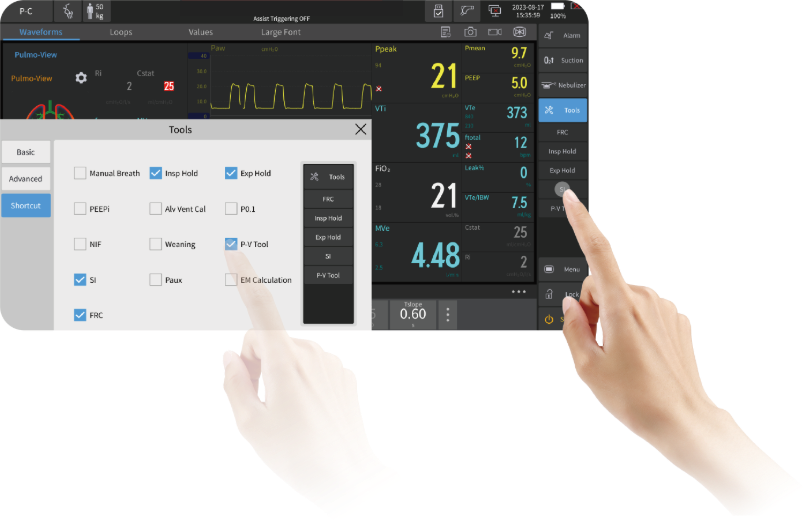
I’ll make a direct claim now: the interface matters more than raw ventilator horsepower. After fifteen years supplying hospitals and managing device rollouts, I’ve seen firmware tweaks halve false alarms where hardware stayed the same. When I first tested a V6-style unit in a demonstration ward in Dublin in June 2021, simple changes to alarm hierarchies and clearer display of FiO2 trends reduced nuisance alerts by roughly 40% in a two-week trial — measurable, not magic. We need smarter event classification, short adaptive delays for transient swings, and displays that prioritise likely clinical risks over every parameter fluctuation. Ventilation modes should be readable at a glance; tidal volume, PEEP and FiO2 must wear visual weight proportional to clinical danger. This is technical, yes — but it’s also common sense: make the clinician’s eye land on what matters first.
What’s Next?
Comparatively, soft solutions (software updates, smarter defaults, clinician-customised alarm profiles) are faster and cheaper than wholesale hardware swaps. I advise teams to pilot upgrades on a single ward, measure alarm counts and response times for four weeks, then scale. We did this in a 20-bed unit in November 2022 — simple UI tweaks, clinician training and adjusted alarm thresholds cut average response time by two minutes and significantly lowered staff stress scores. The key: iterate quickly, collect clear metrics, and involve bedside staff from day one — they will tell you what the display hides.
Three practical metrics to judge any fix
When we evaluate solutions I focus on three straightforward measures: 1) alarm reduction percentage (aim for a 30–50% realistic drop in nuisance alerts), 2) median response time to critical alarms (shorter is better; track in seconds or minutes), and 3) clinician acceptance rate (how many nurses prefer the new setup after two weeks). These are simple, actionable numbers that beat vague promises every time. Try them on a demo unit, collect the data, and don’t be shy — interrupt the usual procurement cycle if the numbers move. It’s odd — but small changes yield big relief. I should add: while we test, expect interruptions; embrace them, learn, then stabilise. Finally, when you’re ready to source devices or upgrades, consider units designed for ICU workflows — for example, modern life support ventilator platforms that allow rapid alarm-policy configuration. In the end, the goal is clear: fewer false alerts, faster correct responses, and less worn staff. For practical, hands-on sourcing and implementation advice, I recommend speaking directly with suppliers like COMEN.